- General
-
 Ідеї
Ідеї

+90
New logo and icon
With the alpha release of Sublime 2, I think that a new logo should be bundled with it
Maybe it's just me, but I find the current icon doesn't describe the application very well. From what I can tell, it's supposed to display that Sublime is focused on the middle of the window, ergo, the code.
A new logo and icon would add a new lease of life to it. Especially for advertising the new editor!
I'm not a designer myself so I wouldn't be able to do this myself. And like always, this is just an idea!
Служба підтримки клієнтів працює на UserEcho


While this isn't related to functionality it seems like it would be straightforward delegating this to a designer or holding a logo design contest.
The existing logo isn't very noticeable, particularly when alt-tabbing.
I have long time ago replaced original icon with:
It looks great to me, has stylized S from Sublime, arrows pointing to center could symbolize concentration and so on.
The only thing to note - it's under GPLv3 licence.
Download SVG
With each beta release, Sublime 2 continues to impress and draw folks from other editors... I say leave the icon design to professionals, and pay someone to do it right.
Here are a few of my favs:
http://dribbble.com/dlanham
http://www.softfacade.com/
http://dribbble.com/cuberto
https://github.com/dmatarazzo/Sublime-Text-2-Icon
I use this icon (and the accompanying document icons included in the github repo linked above) on OS X and it looks great.
Gotta love us mac users and our obsession with icons, lol.
A good icon for the sublime by Dmitry Svetlichny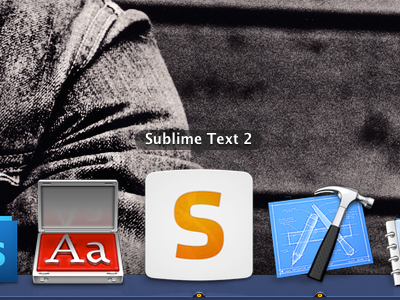
I do like this one better but it's still just a big S on a more or less square background. :P
Can you imagine if every app icon was just a big letter on a square background? I still think a submarine made out of a lime would be awesome. ;)
Very attractive, nicely done.
I agree with Dan Rogers, we should leave the icon design ro proffesionals... Sublime text deserves anything less than a breath taking icon...
Guys, Sublime has a new Icon since a long time. This should be closed, if you still dont like Sublimes Icon, design it yourself. There are more important tasks to take care of, than the goddamn icon... seriously!