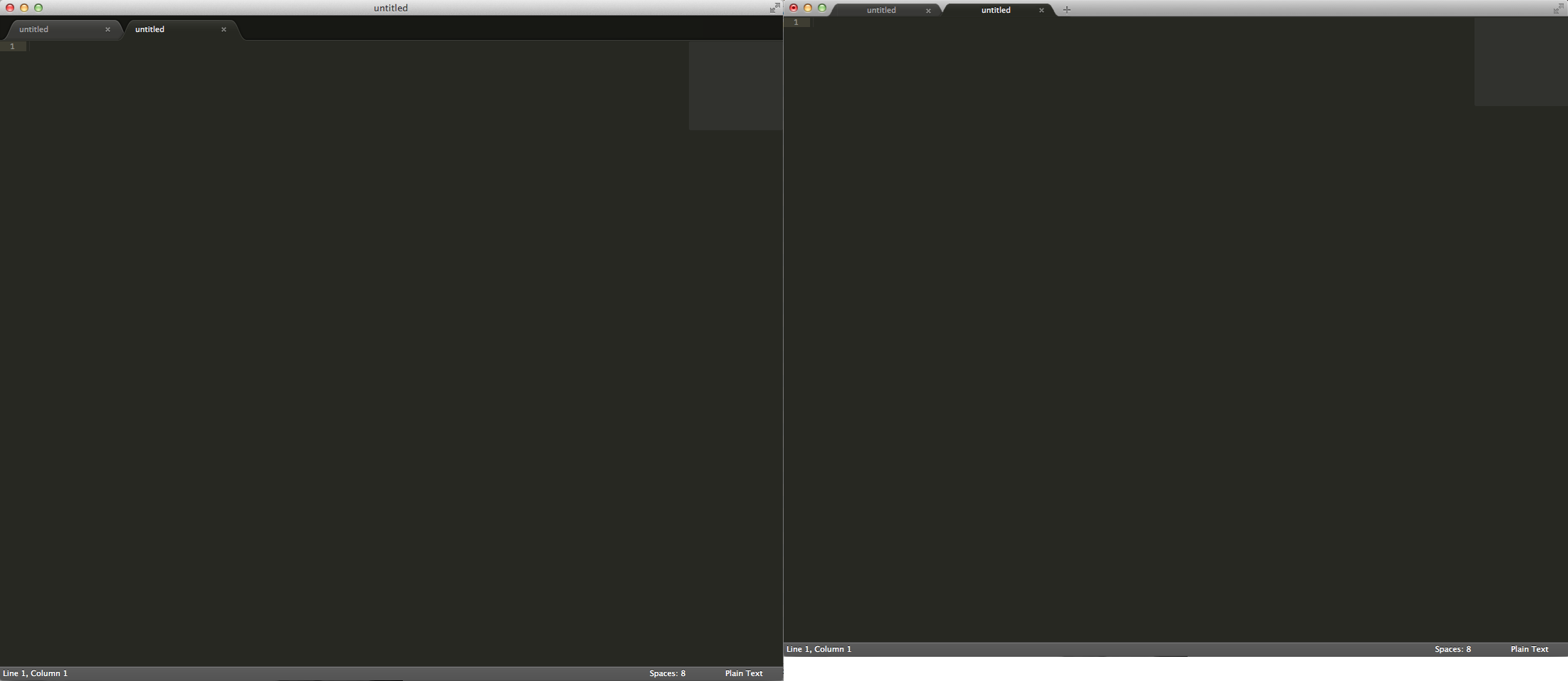
From a programming standpoint, this isn't a trivial thing to do. And it doesn't seem to make much sense from a usability standpoint in my opinion either (remember those top tabs in the Safari 4 beta?)... What happens when you drag the tabs? Or when you have so many tabs open the whole top bar is covered in tabs — how do you move the window?
In addition to these considerations, I reasoned over the multi-rows/multi-columns layout.
No problem here too.
The top bar cab be splitted in two segments, as happens now in ST, to make room for the two or more columns.
The tabs on the second (or more) row still remain placed on a tab bar with a dark background like current implementation. Just an adjustment to make the bars of the same height of the top uni-bar.
Daniele, you make good points. Might I point you to this discussion, then? http://sublimetext.userecho.com/topic/19361-move-tabs-to-the-title-bar-like-in-google-chrome/
You might have better luck posting your mockups there (it's a highly discussed and upvoted request)... :)
The main drawback of "chrome-like" tabs in the menubar is that the tabs are fixed-width, resulting in truncated filenames. Furthermore, giving up the titlebar doesn't allow the user to see the full path / long filename in the title bar.
With the gained space from the unification of the titlebar with the tabs, breadcrumbs could be added, which, beside having the function of showing you the path, could provide a quick access to folder and files.
If you don't need the quick navigation and want to keep the extra space, displaying the file path in the status bar (when there is no status message) could be a solution.
@aristidefl: I don't know about the breadcrumbs and I did think about the status bar... my initial reaction was "great, make me look down instead of up" to see the filename.
But, if I eye-tracked myself I'd admit that it perhaps doesn't matter... as long as there's some means of seeing the full filename somewhere.
There's a lot of empty real estate in the status bar, so you guys are starting to change my opinion about this. However, note that the display file path in status bar feature has very few votes. (Want a tabbed title bar? Want ybakos to stop whining? Vote for the 'display file path in status bar' issue and note the 'dependency' with this 'unified bar' thread.)
As for convincing Jon... you're on your own. In my opinion, implementing tabs in the title bar and preserving the tabs when going full screen, etc will take some work. (Hey you, buy a license!)


Anyway, I think it's soon to discuss on this marginal detail.
https://www.dropbox.com/s/zxet9k3v6jl319h/106328_unibar-2.pdf
With the gained space from the unification of the titlebar with the tabs, breadcrumbs could be added, which, beside having the function of showing you the path, could provide a quick access to folder and files.
If you don't need the quick navigation and want to keep the extra space, displaying the file path in the status bar (when there is no status message) could be a solution.
But, if I eye-tracked myself I'd admit that it perhaps doesn't matter... as long as there's some means of seeing the full filename somewhere.
There's a lot of empty real estate in the status bar, so you guys are starting to change my opinion about this. However, note that the display file path in status bar feature has very few votes. (Want a tabbed title bar? Want ybakos to stop whining? Vote for the 'display file path in status bar' issue and note the 'dependency' with this 'unified bar' thread.)
As for convincing Jon... you're on your own. In my opinion, implementing tabs in the title bar and preserving the tabs when going full screen, etc will take some work. (Hey you, buy a license!)