+20

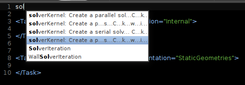
Completion list width

ibbles 12 aastat tagasi uuendaja Mark Evans 11 aastat tagasi 6

I would like to be able to increase the width of the completion list. I have a few snippets with not too long descriptions, less than ten words, but even they become unreadable in the completion list. Same goes for the go to file(ctrl+p) result list, which I would also like to be able to move to one of the sides so it obstructs less of the content of the selected file.


Image 35

An alternative to moving the file result list is to be able to make it transparent by holding a button or something. I ofter use ctrl+p to quickly look at a file file and then escape back to my original file, which either closes or hide the one I just took a quick look at. If I have to press enter to fully go the the file I want to look at, then I don't know how to get back to the file I was editing if I had forgotten the name of it.
Just noticed that the file list is sorted by last active, so going back the the previous file is already easy.
But this still leaves the problem of tab infestation/disappearance. If I have a set of files open and then do a quick-inspect of some file, possible already open, and then escape back, then Sublime knows if the file should be closed or not. However, if the view of the file contents is obstructed by the file list then I have to make that file the active one and I have no way of knowing if that file should be closed or not to retain the original tab set when I have seen what I needed to see.
I'd also love a little more space in the completions window, either as a setting or calculated on mean width of content up to a maximum value. Autocompletion for methods/args become very hard to read :(
+1
A wider completion list would be very helpful for auto-complete for static languages. I am developing a plugin that displays type information in the auto-complete suggestion, but there usually is not enough space.