Uw opmerkingen
I would channel Steve Jobs here and ask "are you nuts?" except it's not in me to be that much of a jerk ;)
The "Soda" theme should definitely come as default, if the creator is willing to donate it. It's gorgeous
Why in heaven would someone opt to ship a less beautiful product without any difference in functionality?
If there's a theme this nice out there for the taking, it seems like a no brainer to me.
Wondering why you would feel otherwise? It's possible I'm missing something obvious?
Heh, I was just about to post "As a matter of fact, I think Sublime Text 2 can be to Mac OS X what Sublime Text 2 can be to Linux :)"
+1, as long as you contact/hire a professional who doesn't suck. After all it was a professional who redesigned the Gap logo :(
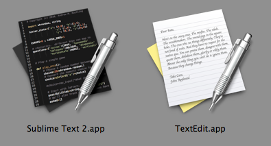
You could always just "adapt" the icons from the OS to include white-on-black. On OS X, the TextEdit icon is actually not so beautiful imo, but there is something satisfying about seeing similar icons side-by-side in my Dock. Another downside - probably not legal
My mistake. Apologies for the wasted time :)
If you need inspiration, take a look at Things from CulturedCode: http://culturedcode.com/things/ Great icon, great UI design too
Customer support service by UserEcho


The feature may be logical and consistent, but that doesn't mean anybody wants it ;)
It would be just as logical and consistent, though different, if Sublime just left "In Selection" set to the last used state. That way, if I'm doing a job where I need to "Find In Selection" a lot, I know it'll stay selected all evening (until I manually untick it again)
Love the program, by the way. I feel a bit guilty leaving these complaints.