- General
-
 Idéer
Idéer

+12
Bold/Italic should be supported for proportionally spaced fonts
Bold and italic font styles in colour schemes currently seem only to work for monospaced fonts (at least in ST3 build 3021). This makes proportionally spaced fonts very much second-class citizens. (I greatly prefer using proportionally spaced fonts for editing text.)
Kundesupport af UserEcho


So has this ever worked?
Was it working in ST2 and stopped in ST3?
Was it working in an earlier build of ST3 and has stopped with 3021?
I never use pro fonts so I have no idea and your post leaves me almost none the wiser about what is happening in that space.
Some more details would help us all understand whatever it is you are trying to tell us or ask for.
Jan,
I’m a relatively new user of ST, so I don’t know whether this is a new problem or not. I’ve only really started using ST as of the ST3 beta, so I also don’t know whether this worked in ST2. It’s utterly trivial to reproduce the problem in ST3 3021, however. The forum discussion here seems to suggest that bold/italic is only currently expected to work with monospaced fonts, hence my above request.
Let me try again to explain the issue, if it still isn’t clear.
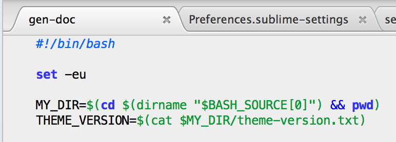
Colour schemes specify bold or italic fonts for the highlighting of particular syntax elements. If one is using a monospaced font, one sees bold and italic text for these elements as one would expect. For example, here is a fragment of a bash script shown using the OS X ‘Menlo’ monospaced font ("font_face": "Menlo" in the user settings). You can see that the ‘set’, ‘cd’ and ‘pwd’ are shown in bold, and the #! line is in italics:
Here is exactly the same file, except with my default font set to Georgia ("font_face": "Georgia" in the user settings).The ‘set’, ‘cd’ and ‘pwd’ are no longer shown in bold, and the #! line is not italic:
This problem happens for all italic and bold syntax highlight styles – proportionally spaced fonts only ever seem to be drawn in the regular font style and weight. Monospaced fonts seem to be fine, and will draw in bold and italic if specified by the colour scheme. I’ve tried several proportional and several monospaced fonts to confirm this.
The issue is particularly bothersome in, for example, Markdown source, where one really wants to see **bold** text in bold, and _italic_ text in italics.
Hope this helps.
This is weird. I don't know much about how such font support is limited but it certainly sounds like a bug or oversight. There are plenty of use cases for proportional fonts in Sublime Text so I'd hope this gets fixed eventually.