+8
Column selection should be in the same column on all lines, even if the line isn't long enough
I noticed that the column selection was only recently added to Sublime, but it doesn't behave as one would expect or how most other editors handle column selection/editing.


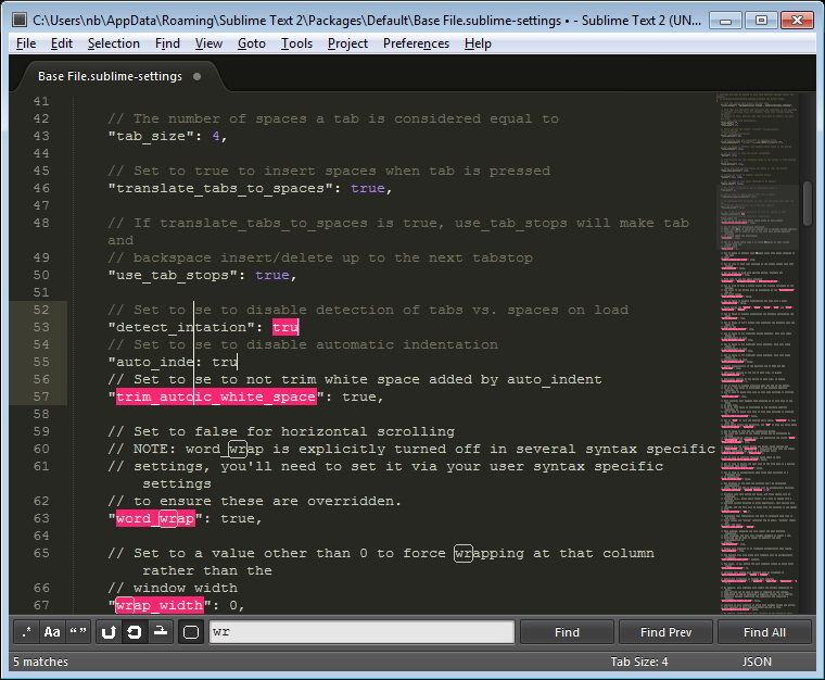
In column selection mode, the selection should be precisely rectangular or vertical (depending if it has any width). In code, there is often lines that have no characters and the column selection should add "virtual spaces" up to the column selector in case anything is typed in. If character is typed (and added to every column in the selection) then the spaces would become real, otherwise they stay virtual (in the case of backspacing).
An easy demonstration of this problem is to column select multiple lines in the settings file, making sure you span multiple settings (which are separated by blank lines). With the column selection having 0 width, press the backspace key a couple times, and you will end up deleting and the end of the previous line and not just in the line that you had selected.

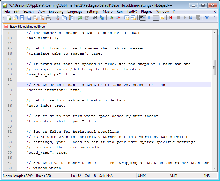
See Notepad++ for an expected behavior.

Customer support service by UserEcho


This is the one thing that I really really miss from TextPad (back when I used Windows).
Multiple Selection is great, but column selection is different, and is a feature that I long for, achingly.
Please Please pretty please can you implement a column selection feature that will help liberate the right hand margin from the tyranny of CR/LF?