- General
-
 Ideas
Ideas

+3
tab row treatment suggestion
Subtle point, I know, but I think the background color of the tab row needs to blend more with the non-selected tabs rather than the selected tab. Otherwise, I think it sends a mixed message visually about what is primary and what is secondary since the higher contrast between the background and the non-selected tabs makes them pop more.
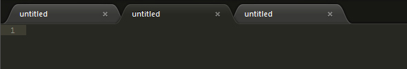
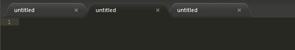
Perhaps this could be set forth as a design guideline and applied to the themes that ship with ST2?
Current:
Suggested:
Customer support service by UserEcho